Information at the right time...
It is surprising how my interests have converged and supported one another over time: computing, technology and programming; data analysis, clinical medicine, neuroscience, clinical neurology and genetics; undergraduate assessments and psychometrics.
In this blog post, I want to discuss the fundamental importance of data in clinical medicine and the overlap between direct care, service management and improvement and clinical research. The overlap and relationships between these three are shown in this schematic:
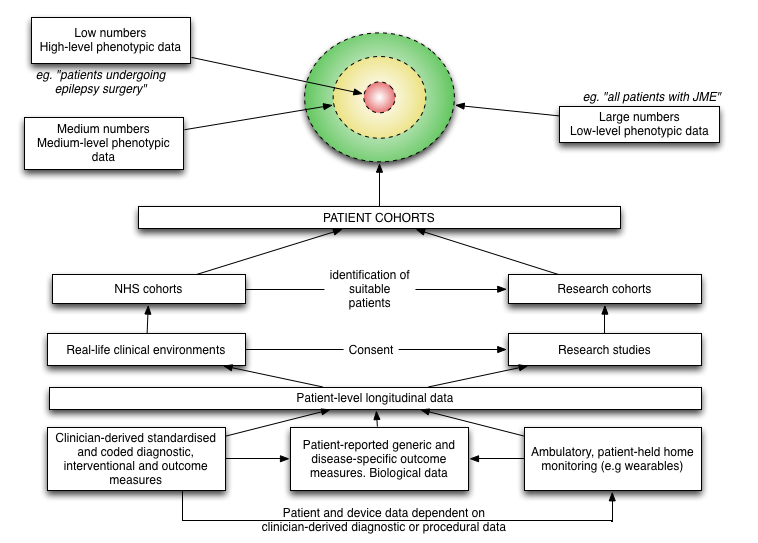
In clinical research, we have relatively small numbers of individuals with highly detailed information (“high level phenotypic data”). In day-to-day clinical practice, we have large numbers of patients with patchy or low level clinical data.
A common theme that runs through this blog is, I hope, that the medical record defines our clinical practice, and the foundation of that medical record is usable data… usable information. We use that information for direct care of individual patients, organising our services to support the care of groups of patients and to perform clinical research.
Creating a data-driven culture
In 2005 I started using R (The R Project for Statistical Computing) for my statistical analysis during my doctorate. I’d been disappointed with SPSS and its point and click user interface and crude scripting language. As a researcher, I realised that I would need to run and re-run many different analyses and remembering how to transform and clean-up in preparation for configuring and then running different types of statistical test was going to be difficult and time-consuming.
I wrote about R on my old blog in 2007 and since then, I have managed to convince many colleagues to adopt it for their own research. In 2005, I didn’t know anyone else using R (except the R-help mailing list) but it was immediately appealing:
- it is a programming language, an environment for statistical computing and not simply an application to run statistical tests
- it results in reproducibility. I can run the same analyses over and over again, for example when my data are updated
- it is open-source
My own research involved clinical epidemiology, phenotype-genotype correlations, clinical genetics and psychometrics and, if you are very keen (and want to know a bit more about ataxia), you can read my thesis.
Deep phenotyping
As a junior researcher, I quickly learnt the value of “deep phenotyping”, the importance of systematically recording the longitudinal morphology of disease for individual patients, aggregating those data for groups of similar patients and understanding the cohort by the use of those data. To do this, one needs to consider the hypotheses and ensure that the appropriate clinical data is captured and recorded in a format that allows those hypotheses to be tested. My project looked at clinical progression, rating scales, the use of wearables and genetics with the combination of different sources of data to make logical inferences about these patient groups.
Clinical research requires compromise, intuition and judgement:
- how much data should be collected?
- what will be important?
- what can be collected in the timeframe?
- how many patients do I need to assess in order to reach a valid conclusion
- how will I record that data and in what format so that it is practical for storage, retrieval and analysis?
Early on, we generated lots of ideas. For example, I gave up on the wearables project when we realised that patients were recording 0 steps in 24 hours, that the devices were too cumbersome and so were being left on the shelf rather than being worn. In those days, the technology was such that the wearable wasn’t actually very wearable.
As you might have already concluded, none of these questions are unique to the specific neurological conditions I was interested in at the same and in fact are generic and widely applicable.
Building analytics
I built an analytics pipeline in which clinical and genetic data were extracted, cleaned up and transformed and analysed. This combined a database and used R to do the rest, generating analyses and charts based on those data. With Sweave, I combined those results into reports, clinical papers and eventually my thesis by linking R and LaTeX:
We identified \Sexpr{nrow(subset(cl, excluded==F))} patients with a reported history of
cerebellar ataxia between 1999 and 2007 in South East Wales.
Applying inclusion and exclusion criteria as described above resulted in a subset of
\Sexpr{cf.loca$total} with chronic progressive \ac{loca} with no identified aetiology
as a denominator population for study. There were \Sexpr{cf.loca$num.familial}
(\Sexpr{nrow(subset(loca, fh==T & sex=='Male'))} male,
\Sexpr{nrow(subset(loca, fh==T & sex=='Female'))} female)
familial cases segregating in \Sexpr{cf.loca$num.families} kindreds
and \Sexpr{cf.loca$num.sporadic}
(\Sexpr{nrow(subset(loca, fh==F & sex=='Male'))} male,
\Sexpr{nrow(subset(loca, fh==F & sex=='Female'))} female)
sporadic patients.
When run, this would output the following text:
We identified 401 patients with a reported history of cerebellar ataxia between 1999
and 2007 in South East Wales. Applying inclusion and exclusion criteria as described
above resulted in a subset of 178 with chronic progressive LOCA with no identified
aetiology as a denominator population for study. There were 55 (26 male, 29 female)
familial cases segregating in 38 kindreds and 123 (79 male, 44 female) sporadic patients.
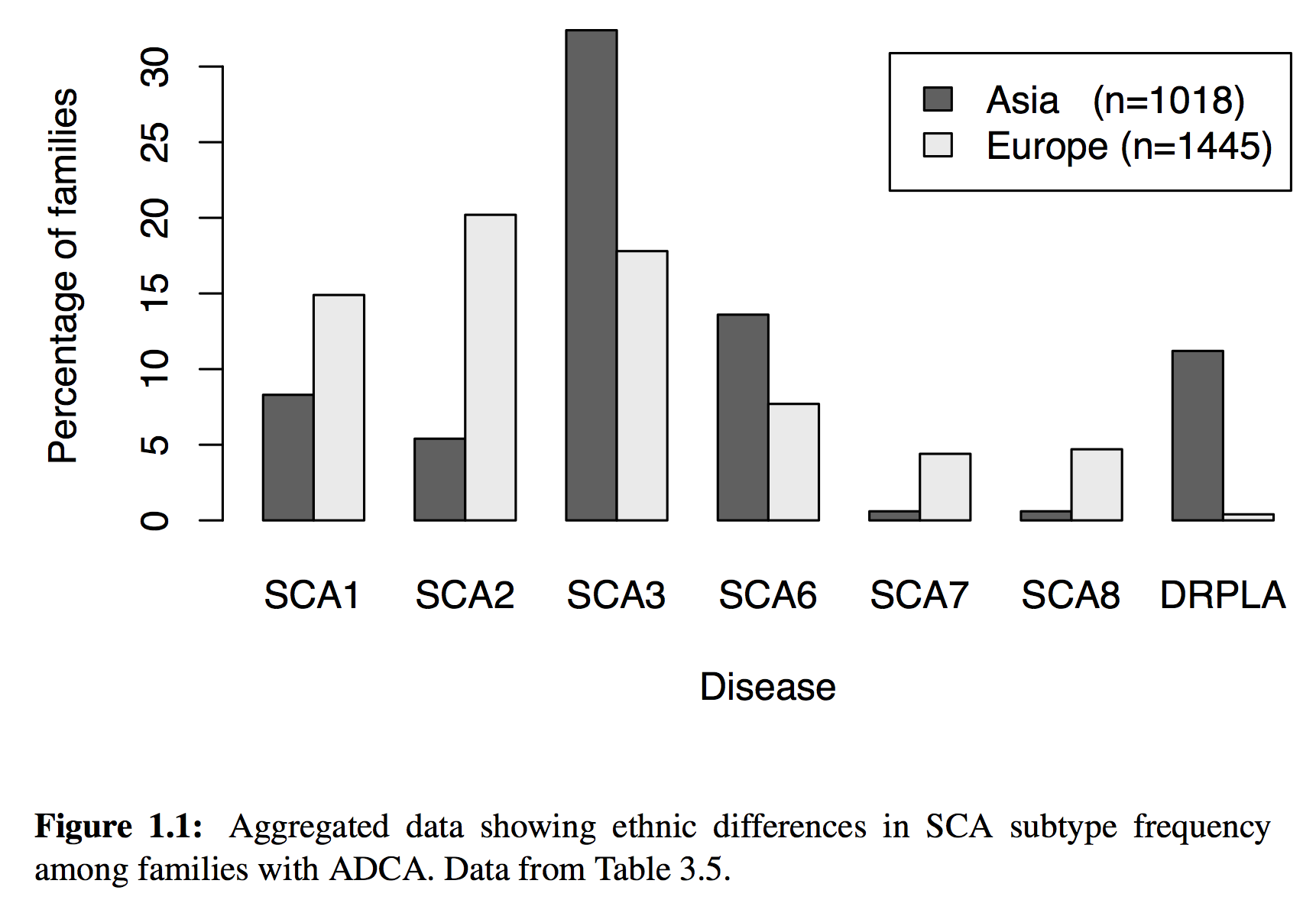
But of course, much more sophisticated analyses were possible, including the dynamic generation of charts, maps and statistics. For example, this chart is dynamically generated from our data source
generated using the following code:
\begin{figure}[!tb]
% This is the same as the ACNR graph, but using the (NEW) new SCA prevalence functions
<<sca-prev-adca, echo=FALSE, quiet=T, fig=T,width=6,height=4>>=
sp = sp.sca.prev(subset=patient.type=='ADCA' & total>10 & (region=='Asia' | region=='Europe' ), by=region, FUN=sp.percentage)
barplot(as.matrix(sp[,c(2:7,12)]), beside=T,
		xlab='Disease', ylab='Percentage of families',
        main="", 		#  Ethnic differences in SCA subtype frequency",
        legend.text=c(
		    paste('Asia   (n=',sp[sp$region=='Asia',]$total,')',sep=""),
		    paste('Europe (n=',sp[sp$region=='Europe',]$total,')',sep="")))
@
\caption[Aggregated data showing ethnic differences in SCA subtype frequency among families with ADCA.]{Aggregated data showing ethnic differences in SCA subtype frequency among families with ADCA. Data from Table~\ref{tab:sca.prev.adca}.}
% \cite{\Sexpr{print.citations(sp$cite)}}
\label{fig:sca.prev}
\end{figure}
The sp.sca.prev() function source code is here.
As a result, all of my papers and my thesis were built automatically whenever I wanted, simply by running make that would run a series of steps in a Makefile. Consequently, I could identify any obvious errors in data entry quickly and ensure they were fixed as well as build analyses based on interim data with the confidence that they could be run again and again as data were added. I did all the work in LaTeX, R and used subversion as a version control system.
So what? Different lenses, same data
We’ve been discussing data warehouses, data lakes and analytic pipelines within NHS Wales. Some of us are pushing for an “open platform” based on a foundation of structured data recorded in using open standards and integrating a range of new and legacy services and systems via an API-approach (API - application programming interface) while others think we should be getting on with developing applications and thinking about interoperability later.
My clinical colleagues want the right information about the patient in front of them, irrespective of organisational boundaries, so that clinical information recorded by other teams in different organisations, or even in different countries, is available at the point-of-care. We are overloaded by information, and this will increase (particularly given recent and ongoing disruptive influences) so we need the right tools to make sense of that information. Presently, much of the administrative data is computerised but most clinical data exists only on paper.
My more senior clinical and managerial colleagues want to understand more about how our services perform and how can they be improved. They want to aggregate individual patient data and prepare data to inform decisions across our organisations and need to feed much of that information to other authorities as part of central returns. As only administrative data are routinely digitised, most analytics are focused on administrative matters, so we might know how many people were seen, but not really have an idea as to why.
My academic colleagues want to recruit patients into clinical research and capture data in a much more systematic and structured way and use that information to study and publish and inform.
The answer to all three requirements is, of course, data.
While we may need to include much more detail for our research projects, I cannot stress the importance of the systematic and routine collection of outcome data in normal clinical practice for direct clinical care and management of our services.
Adopting a data-driven clinical practice
So as I wrote previously:
We should be focusing on data first, as data as the solution to a problem. Data, structured, understandable, semantically interoperable data are the foundation on which clinical applications and our analytics can run.
So, what was wrong with my research analytics pipeline? Although at the end of it I could run and re-run it and get almost immediate results, my data were not stored in a standardised format and my code can’t easily be picked up and used by others.
It can be done differently: storing structured, informative and useful clinical data recorded by patients and health professionals; combining data from multiple sources to add value to information and creating learning adaptive systems that support our work.
Here is an example I have used before, in which I present a dashboard on which the important information for a patient with motor neurone disease is aggregated in a single view. The determination as to whether the patient has a gastrostomy (or other kinds nutritional support) is a sequential look at the record of procedures performed (insertions and removal of gastrostomy tubes):
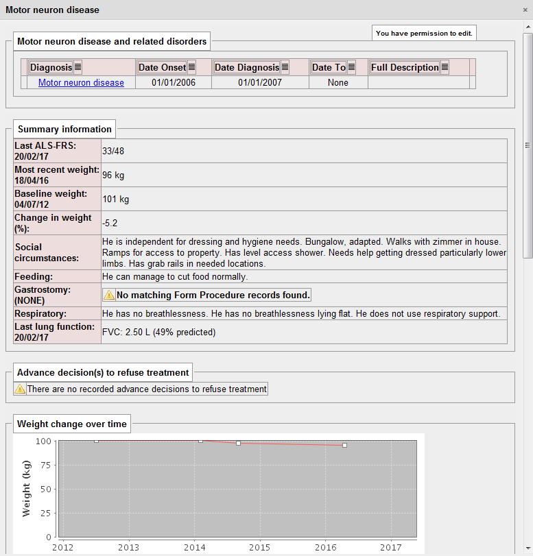
That dashboard took me about 10 minutes of work to write as all of the important information was already being collected in a sequence of clinical encounters by my colleagues from palliative care, speech and language, dietetics, specialist nurses and neurologists.
The power of aggregation…
The EDSS is the expanded disability scale score, a relatively easy-to-use scale running from 0 to 10 that is used as a clinical indicator of disability. Health professionals can record it but we can also derive the score directly from patients using my iPad application:
The following dynamically generated chart shows a single patient’s disease course over time compared to every single other patient we know with multiple sclerosis or a type of that disease:
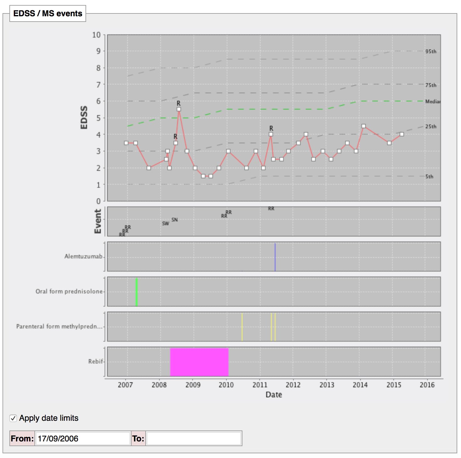
The single patient’s course is shown by the red line, with relapses (acute deteriorations) marked with an “R”. The dotted lines are like the centile lines on a baby’s growth chart: from disease onset, the median disability for the whole cohort is shown. At a glance, we can then see whether an individual patient is deteriorating more quickly than expected or is more disabled that their peers and helps us to tailor their treatments appropriately. In patients with aggressive disease, we might choose to use more aggressive treatments with a greater risk of side-effects.
The SQL code that identifies all patients with any type of multiple sclerosis, tracks their progress and aggregates the disability data is here.
Iteration
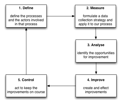
But we don’t stop there. We continue to build statistical models to track disease progression, combining different outcome measures and their proxies to try to understand the disease. As a result, our work will never be done; we can generate new models of disease progression that better predict deterioration and must embed that work into our day-to-day clinical practice. As such, we should aim for a virtuous cycle of continuous improvement, embedding clinical research into our day-to-day clinical practice in a similar way to the Six Sigma quality initiative:
Machine learning is a useful addition to our analytics platform. We can already use standard survival analysis to identify the factors that are important in predicting survival and subsequently build a heuristic to help us in our clinical decision making. New technology offers us hope to improve those models and to speed up the iterative cycle to build continuously adaptive and learning systems.
Here is a schematic representing how I think we need to create an open platform for healthcare in Wales:
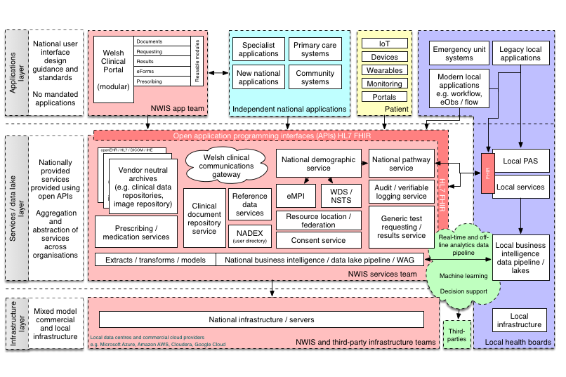
In this schematic, the platform represents a range of APIs providing access to a unified aggregated view of a single patient record, but the other definition of a “platform” is of a multisided market:
Interestingly, another definition of a “platform” is a set of services that bring together users and providers to form a multisided market. Is it possible then to take our “open platform” and start to think of a future in which we have products and services that actually do enable a re-imagining of healthcare provision to bring together patients, carers, health professionals, commissioners, analytics, researchers and all other stakeholders in a safe and secure manner? (see a previous blog post)
At the moment, our health platforms, if they exist, are lopsided asymmetric systems in which patients play little or no role. We must start thinking about creating a data-driven architecture that corrects this asymmetry in power and control.
In all cases, the foundation of that work is data. Technology is the enabler; it can release the value from our data.
Mark