Mapping the electronic health record 1/2
This blog post is based on my presentation at MapCamp 2021.
You can watch a video recording of that presentation if you like, but this post is a deeper dive into some of the detail.
The source code for the Wardley maps are available on github.
Key messages
The main messages are:
- There are many parallels between clinical decision making and strategy.
- We need information at the right time for our decision making, with feedback loops, whether for direct care, management of services or reproducible research.
- Health and care should be data-driven.
- Health and care should be based upon openness, transparency, collaboration and continuity, with meaningful data.
- Trying to fix health information technology through the prism of an organisation-centric electronic health record is difficult and we need to step back and re-appraise.
- Understanding the needs of the EHR (electronic health record) is useful in understanding how to deconstruct the EHR.
- Modern technology companies have generally failed in health and care so far. They now focus on generic data and computing services but cloud technology should be more than simply moving a data centre to someone else’s kit.
- We should be building the tools to build EHRs, not another EHR.
- The foundational software and services and tools to build EHRs should be commodities, open-source and widely available leaving the market concentrate on higher-value differentiation to support decision-making. Such services can and should be provided as shared, highly resilient, managed services.
- A learning health and care system must be flexible and adaptable, so the priority should be in providing configurable composable tools to manage workflow and orchestration of processes across organisational boundaries.
What is Wardley mapping?
An excellent way to understand our current state is to start with user needs. We need situational awareness.
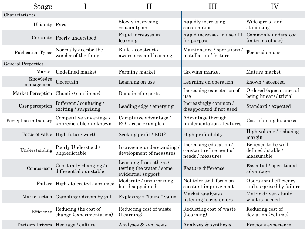
Wardley mapping draws a chain of user needs from top to bottom, demonstrating the required capabilities on a chart that moves from left-to-right in which things on the left are poorly understood and in evolution and things on the right are evolved and commodities.
From “What’s in a Wardley map / cheatsheet” By Simon Wardley, 2016.
As a result, you will find potentially high-value but perhaps poorly understood, poorly systematised elements on the left of the chart.
Over time, these elements are likely to move rightwards and become more accepted. As such, the map helps you realise, or at least prompt debate, on where to invest your time and effort.
In addition, you might find elements of your organisation, or your ecosystem, seem to be in the wrong place. For example, you might be building your own data centre and your organisation is treating it as leading edge; as you draw your map you realise that is wrong.
Maps facilitate shared discussion.
All my maps are wrong but I hope they might be useful!
Let’s start!
1. Clinical decision making
I would like to discuss diagnosis, management and decision making and the use of data in supporting the health of a nation.
There are parallels between clinical decision making and strategy.
Our default must be that we’re always orientated towards action - so that means making decisions.
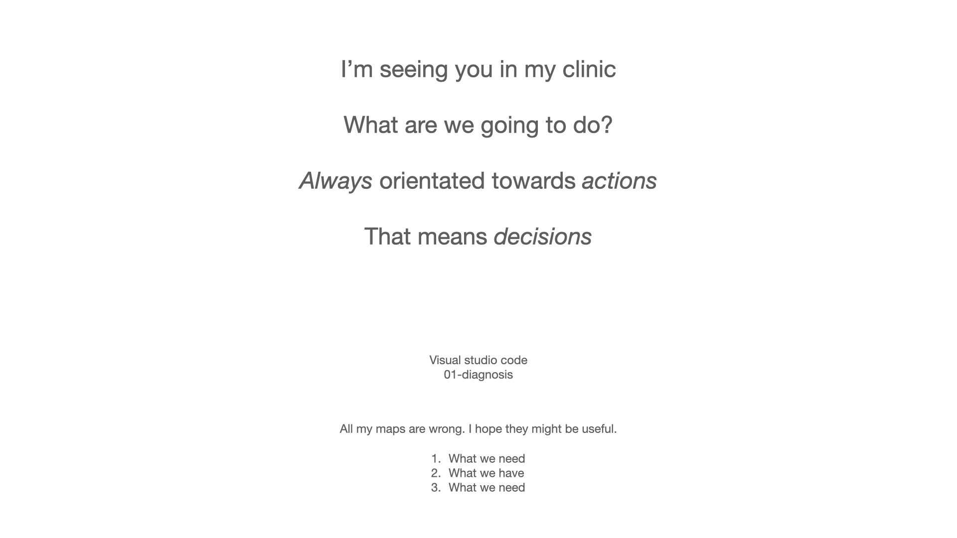
If I’m seeing you in my clinic, we need to make a diagnosis and a management plan together - we need to ask ourselves what are we going to do; it requires *information at the right time. We might take action and measure the response and change our course.
Most of what we have in health information technology is unintentionally designed and it’s evolved organically and it’s not fit for purpose.
If you’ve not used Wardley mapping before, this map may look complex. But it isn’t. We simply need to read it from top to bottom. I’ll explain this in more detail below.
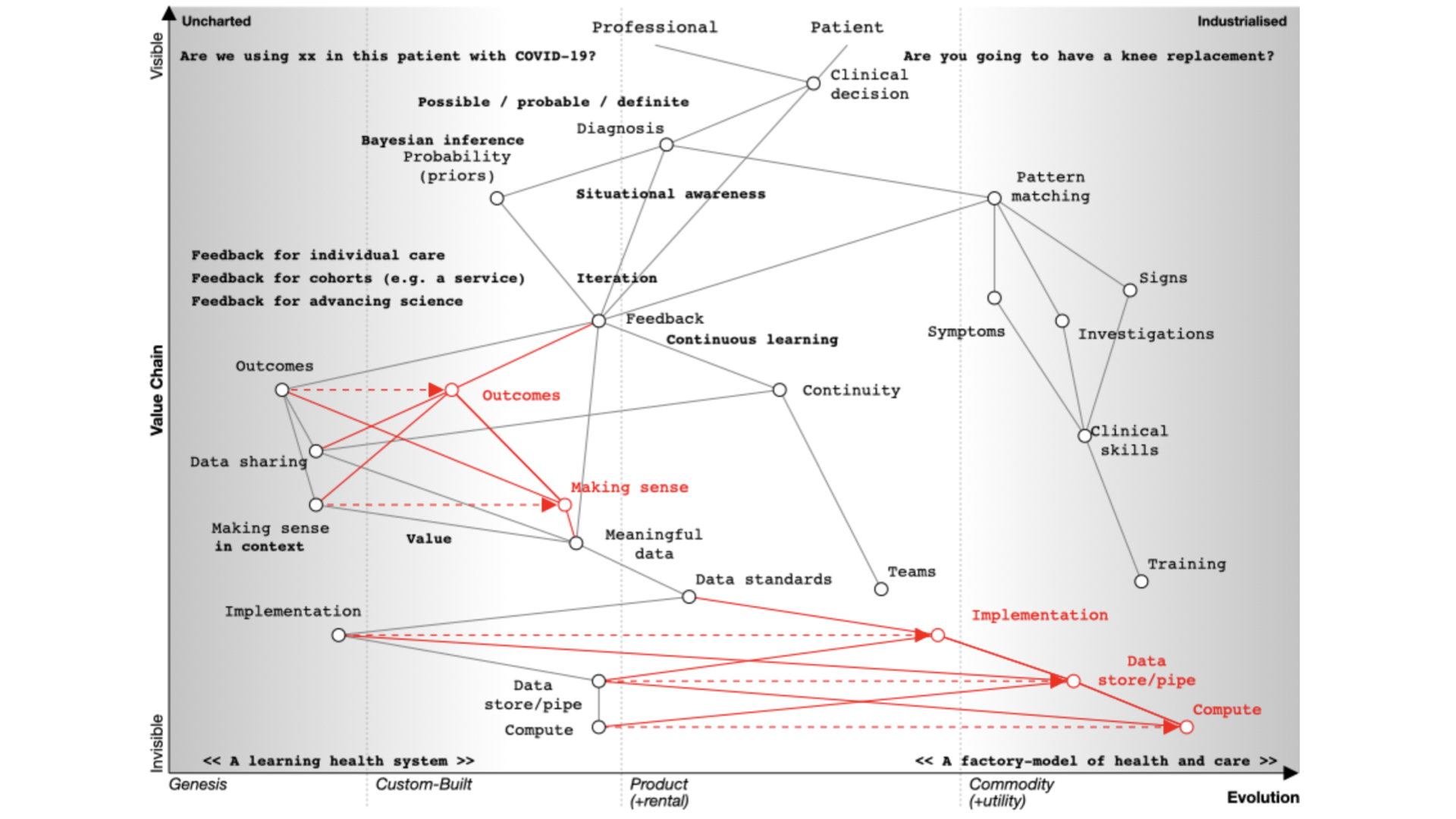
We start with a situation of uncertainty. We benefit if we reduce the uncertainty around a specific decision so that we can make better decisions.
At the top of the map, we have a professional and a patient and we’re making a decision.
- Are you going to have that knee replacement?
- What are the trade-offs here?
- What are the pros, what are the cons?
- Are we going to use this new treatment with this patient with COVID-19?
- How do we identify the patient with COVID-19 who’s going to need higher level care?
Whatever the decision, it is dependent on our diagnosis of the problem. I’ve annotated ‘diagnosis’ on the map as ‘possible’, ‘probable’ or ‘definite’ so already we’re starting to think we are creating something that is iterative.
We’re going to need feedback loops because we may need to make a speculative diagnosis and confirm and adapt as we go. We do not have a linear process but instead we use results to not only confirm but refute our thinking. Feedback loops support the ‘clinical method’ in which we combine information about diseases with information about the patient and our context.
We need to understand that a priori probabilities - we use Bayesian inference based on the prior probability of that diagnosis.
That means that if a patient has a fever and we are in Africa it’s likely to be a different diagnosis than if one has a fever in the United Kingdom. Context matters.
We also work on pattern matching:
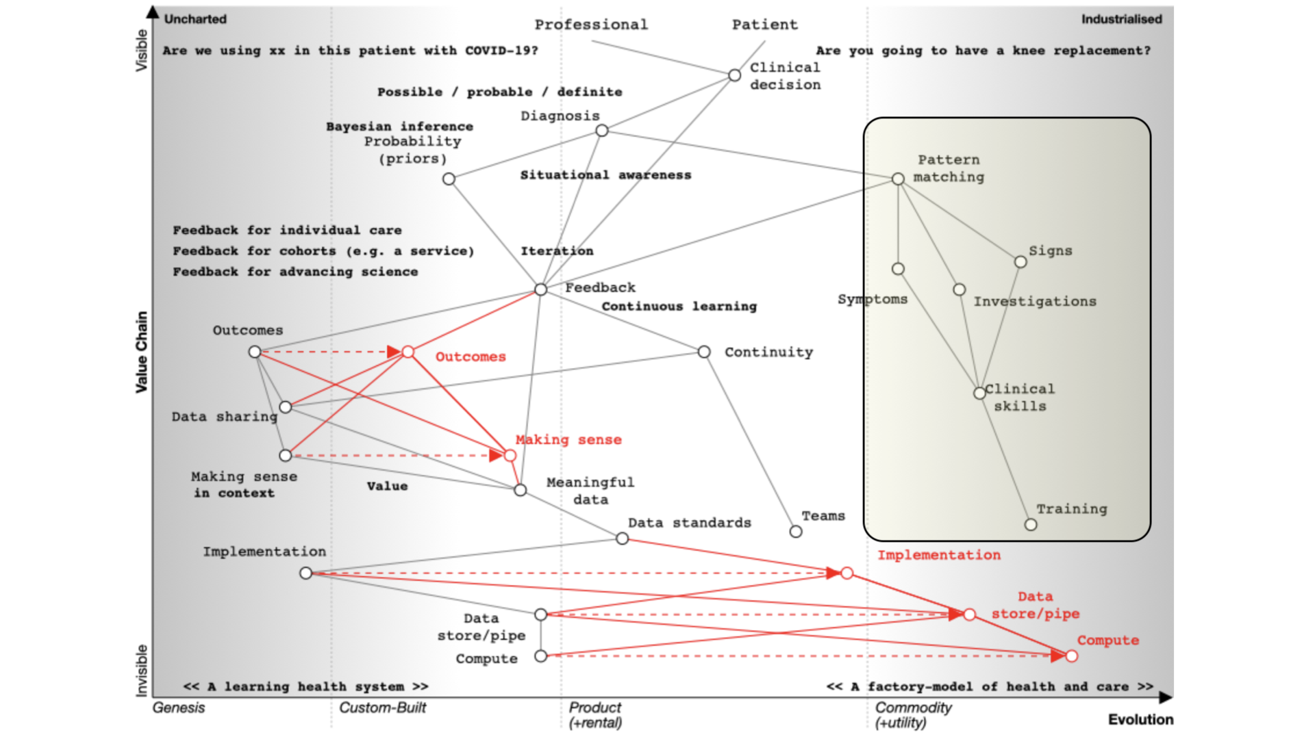 That’s what we teach at medical school and it’s well developed and well evolved. We teach it we expect it to be done propertly and consistently. We look at symptoms, what the patient describes; signs, the things that we can find on examination and we use investigations and all are dependent on training that occurs over many years. It should be no surprise that the patterm-matching pathway is over on the right of our map.
Learning through doing - feedback
We learn through a process of ‘doing’ which makes feedback essential. As a result, in the map you can see an iterative loop where we’re continuously learning.
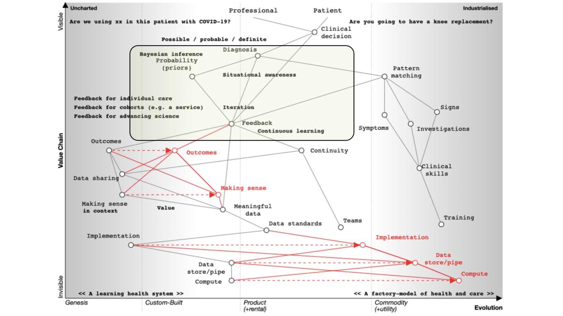
You can imagine that type of feedback loop in three broad categories of iteration:
-
You’re caring for a single patient and arrange tests or treatments and use the results and outcomes to modify the plan.
-
You’re looking at cohorts of people - e.g. those attending a service or facility, or somebody as defined by their characteristics such as ethnicity, age, problems, diagnoses, or the treatments that they’ve had.
-
You’re trying to advance science so it’s actually clinical research in which a group of patients is compared to another after, perhaps, randomisation, or simple observation.
Frequently, these three use-cases are treated very separately, which we’ll discuss later. Ask yourself why when they are fundamentally the same, but perhaps at different levels of acuity and consent. All need to be reproducible and replicable across different cohorts.
Supporting continuous learning
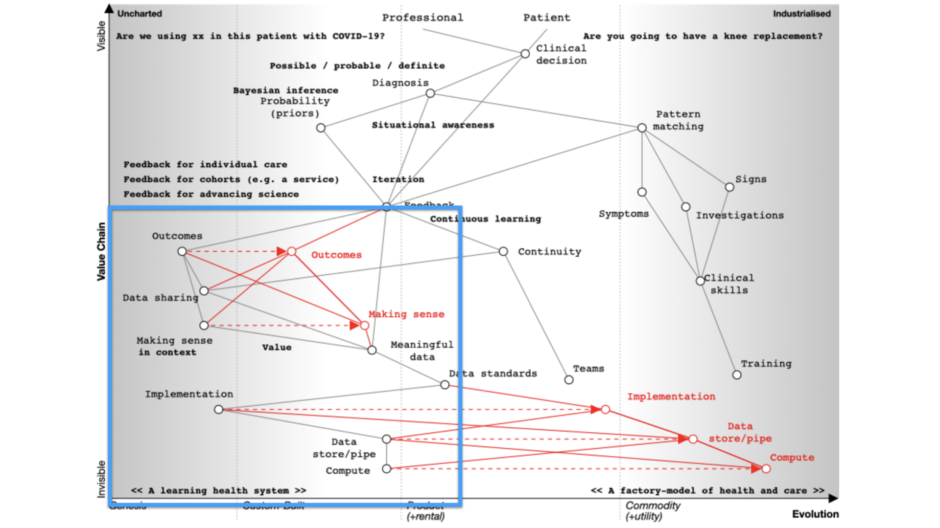
For continuous learning we need continuity and a focus on outcomes.
Paradoxically, many digital tools reduce continuity because they are used as part of reducing health and care to a system focused on transactions like a call-centre.
How do we assess what we’re doing unless we’re measuring outcomes in a systematic fashion?
If we need continuity and we want to focus on outcomes we need to routinely and systematically share data. Currently, it is not, except for specific examples such as registries.
Similarly, we’ve got to make sense of that data in context. If we’re going to measure outcomes, it’s no good just assuming that we can interpret those results - we need, as is plotted on the map, meaningful data and supporting data standards in order to aggregate, make sense and deduce.
For example, I’ve got work that shows how a patient with multiple sclerosis progresses over time but that only makes sense if you compare that patient to the rest of the cohort.
We need tools and data in order to support our decision making. That’s because we need to collect the same kind of structured data and inculcate semantic interoperability with widespread implementation of open standards.
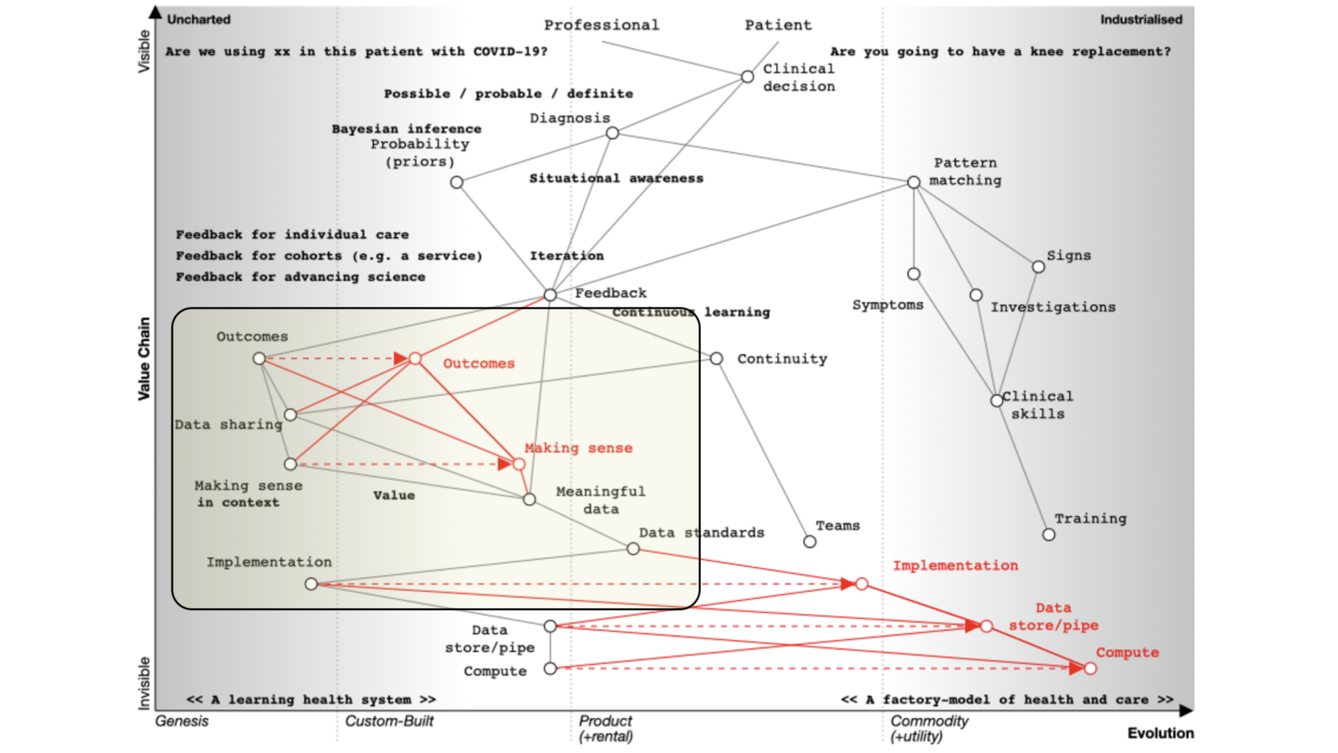
Current implementation of standards is patchy. Many implementations are proprietary, and it is usually more difficult to use a standards-based approach than something custom-built that tightly couples components with end-to-end bespoke integration.
In many circumstances, health and care providers need to buy a product in order to implement a standard. That’s akin to you needing to buy encryption for your web browser.
It therefore follows that there is an opportunity to disrupt the status quo with readily available open-source implementations of data standards and making data standards and data interoperability commodity ubiquitous across our ecosystem. This is a cultural change that is gaining momentum.
So the maps help us identify the areas we might wish to focus our attention.
I’ve spent my own time building a suite of open-source libraries and services because that work is important and foundational.
Building a learning health system
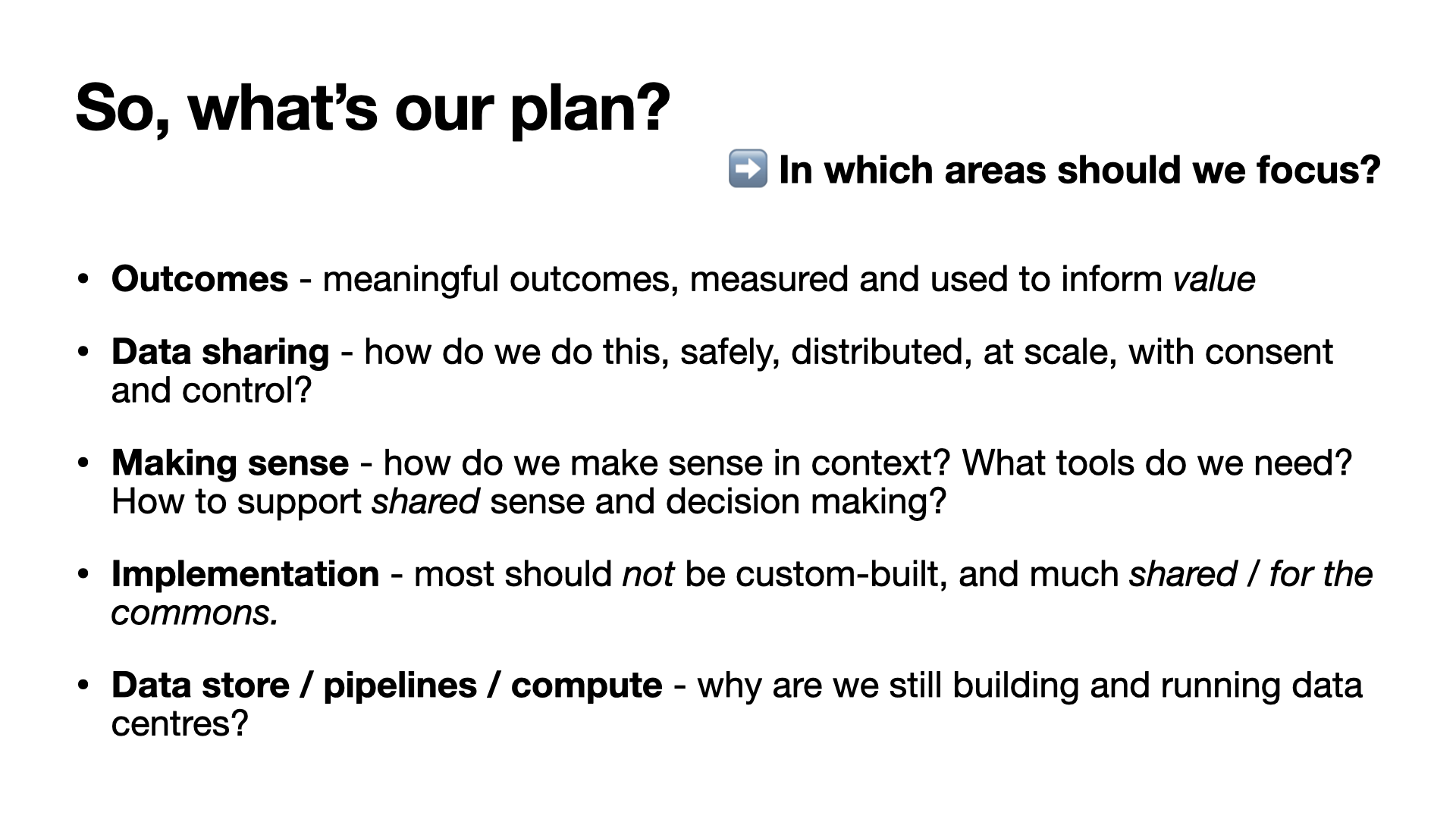
If we are to build a learning health system, we must therefore:
- focus on meaningful outcomes
- consider value
- share data - safely distributed at scale with consent and control
- consider how to make sense of data - making it useful.
- open source commodity tools and resourcec that make collecting and making sense of data straightforward - a ‘commons’ for health and care.
We want the right information at the right time; accessible and useful.
The next post in this series will explore what we already have in health and care and will be published soon.
Mark